Case study
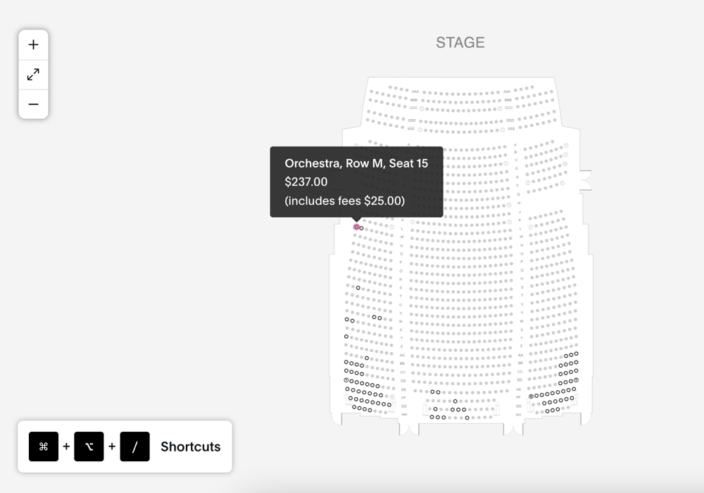
Full keyboard navigation for a select-your-own-seat interface
Seat selection interfaces are some of the most complex tools on a venue's website, and often the least accessible.
The challenge
The seat map was built as an SVG within a React application: rows and levels of individually clickable seats, colour-coded by price tier and availability, with no way to reach or select a seat without a mouse. For keyboard-only users, switch device users, and many screen reader users, the booking journey was effectively blocked.
What I did
The seats themselves were non-semantic SVG elements with no native interactive role, state, or spatial relationship to one another, so before any navigation could work, I had to solve how a system should decide what "the next seat in this direction" even means on an irregular venue layout.
- A custom seat-distance algorithm. I wrote a React script to calculate the nearest seat in any given arrow-key direction, weighing Euclidean distance against seat number within the constraints of the current level, section, and row. Raw Euclidean distance alone breaks down on real venue layouts, curved rows, offset sections, gaps for accessible spaces, so the algorithm biases toward seat-number adjacency within a row while falling back to spatial distance when moving between rows or sections, keeping movement predictable and matching what a sighted user would expect to happen next.
- Arrow key navigation across the whole map, moving seat to seat within a row and row to row, driven by that distance calculation.
- Level change support, so users could move between tiers, balconies, or sections without losing their place or being forced back to a mouse.
- Deliberate focus release, via a dedicated keyboard shortcut that lets users move focus out of the seat map to sidebar controls or an active minicart, rather than allowing arrow key navigation to silently carry focus into adjacent interactive elements. This keeps the map's own navigation predictable and contained, while still giving users a clear, discoverable way to leave it.
- Visually hidden live region announcements for screen reader users, such as "no seat found in that direction," triggered at the edges of the map or the end of a selectable row, so non-visual users get the same boundary feedback a sighted user gets by simply seeing the edge of the map.
- ARIA roles, states, and properties layered onto the non-semantic SVG by hand, so each seat's identity, price tier, and availability were correctly exposed to assistive technology, validated against WCAG's success criteria for keyboard operability and name/role/value.
- Documented shortcuts for users, since a keyboard interaction model is only useful if people know it exists. Available shortcuts and controls were made clearly documented and discoverable within the interface itself.
In practice
The outcome
Keyboard-only and screen reader users can now browse, navigate, and select seats across every level of the venue independently, with the same spatial understanding and feedback that sighted mouse users have always had.
Working on something similar?
If your product has a complex, custom interaction like this, a seat map, a floor plan, a scheduling grid, that doesn't fit an off-the-shelf accessibility pattern, I'd like to hear about it.